Accenture Interactive Website
Expanding an existing product design kit to freshen up Accenture Interactive's website
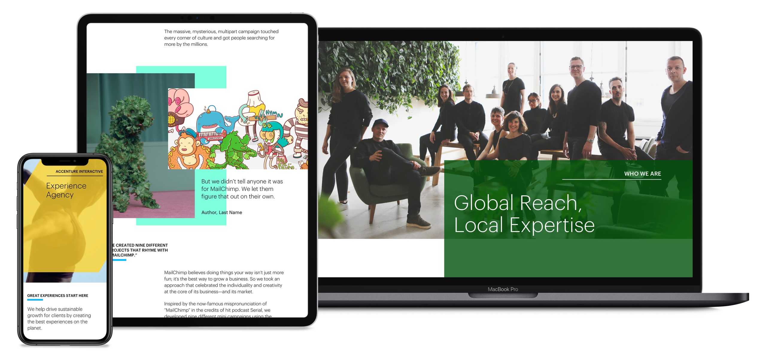
THE CHALLENGE
The current Accenture website uses an existing product design kit (PDK), but the challenge is the PDK doesn't cater to the needs of Accenture Interactive and its recently acquired agencies. Our role is to create a refreshed look for A-interactive and expand the PDK that would allow them to showcase their works.
OUTCOMES
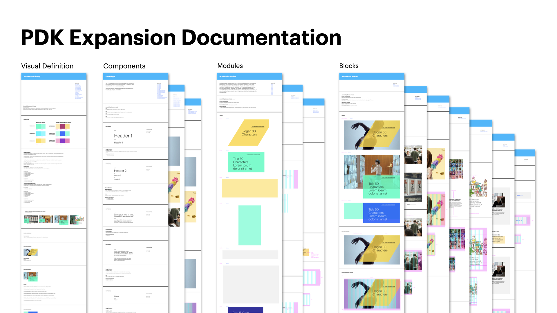
We created an expanded version of the existing PDK that is a flexible and adaptable solution that answers stakeholders and the development team's immediate needs. We built a series of design pages to showcase a comprehensive design system, including 8 blocks, 4 animations, 3 modules, 3 components, and 1 visual definition.
My Role
Interaction Designer - I was responsible for competitive analysis, conducted qualitative research, and synthesized results. I have also defined product interactions based on business, technical and design considerations.
THE PROCESS
Who are Our Users?
During our research we have identified two types of users:-
Job seekers and potential employees, who are looking for companies that have strong cultures and impressive works;
Potential clients who are interested to understand the projects that we've done and how we are going to take our clients along the journeys.
Competitive Analysis
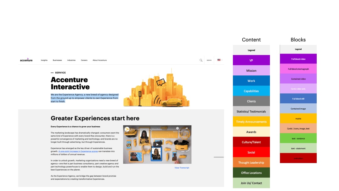
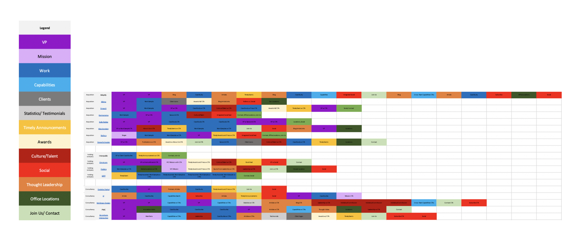
With this idea in mind, I began the competitive analysis by comparing different companies' websites to understand how they capture their audiences' attention. I looked at consultancies' websites, agencies' websites, as well as acquired companies to understand how they structure their contents and what kind of design elements are they using to display these contents.
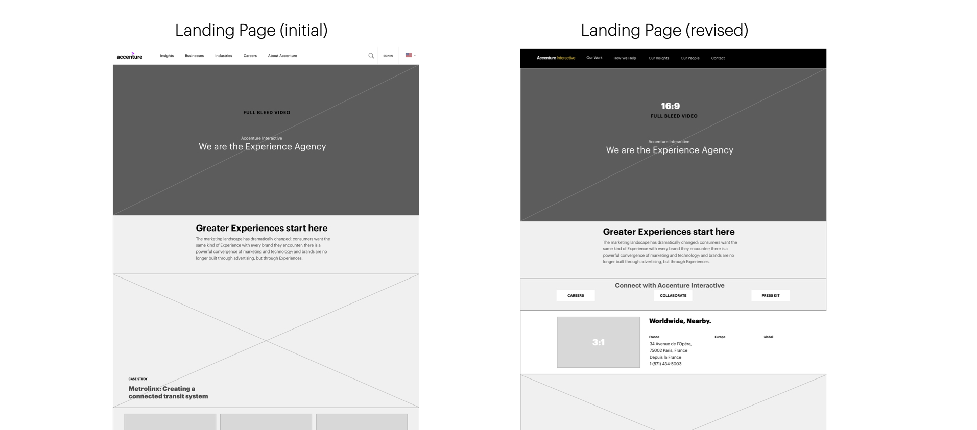
One interesting thing that was not defined in the original scope was the Navigation Pattern. During my research, I noticed that Accenture's website has multiple site navigation styles, which created confusion in user experience.
Existing Website
Stakeholder interviews
We interviewed 16 stakeholders, including several acquisitions, to understand their current knowledge and experience with Accenture Interactive website and mapped them based on opportunities and pain points. To my surprise, a stakeholder told me that the Netherland created a microsite to showcase their works.
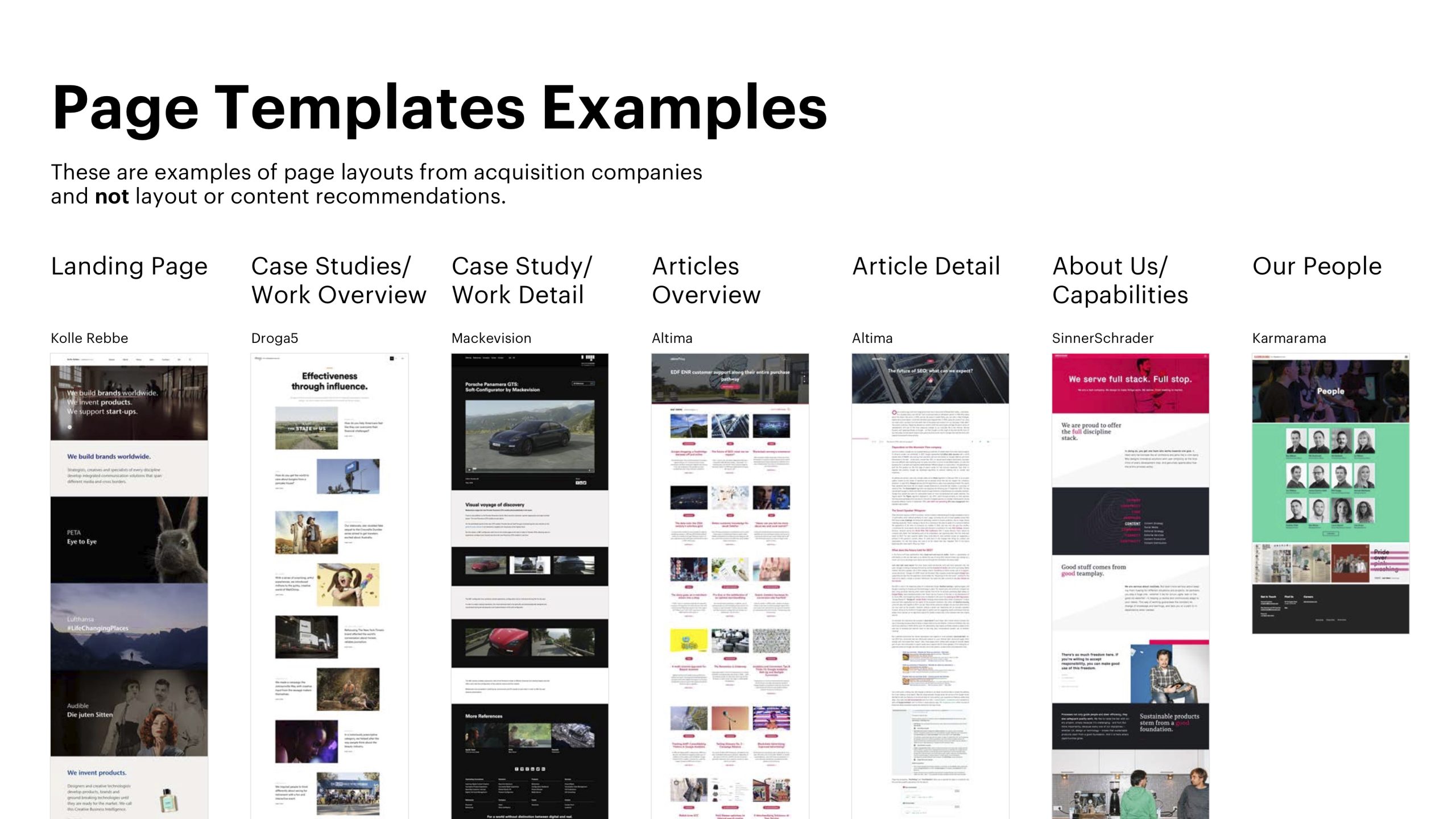
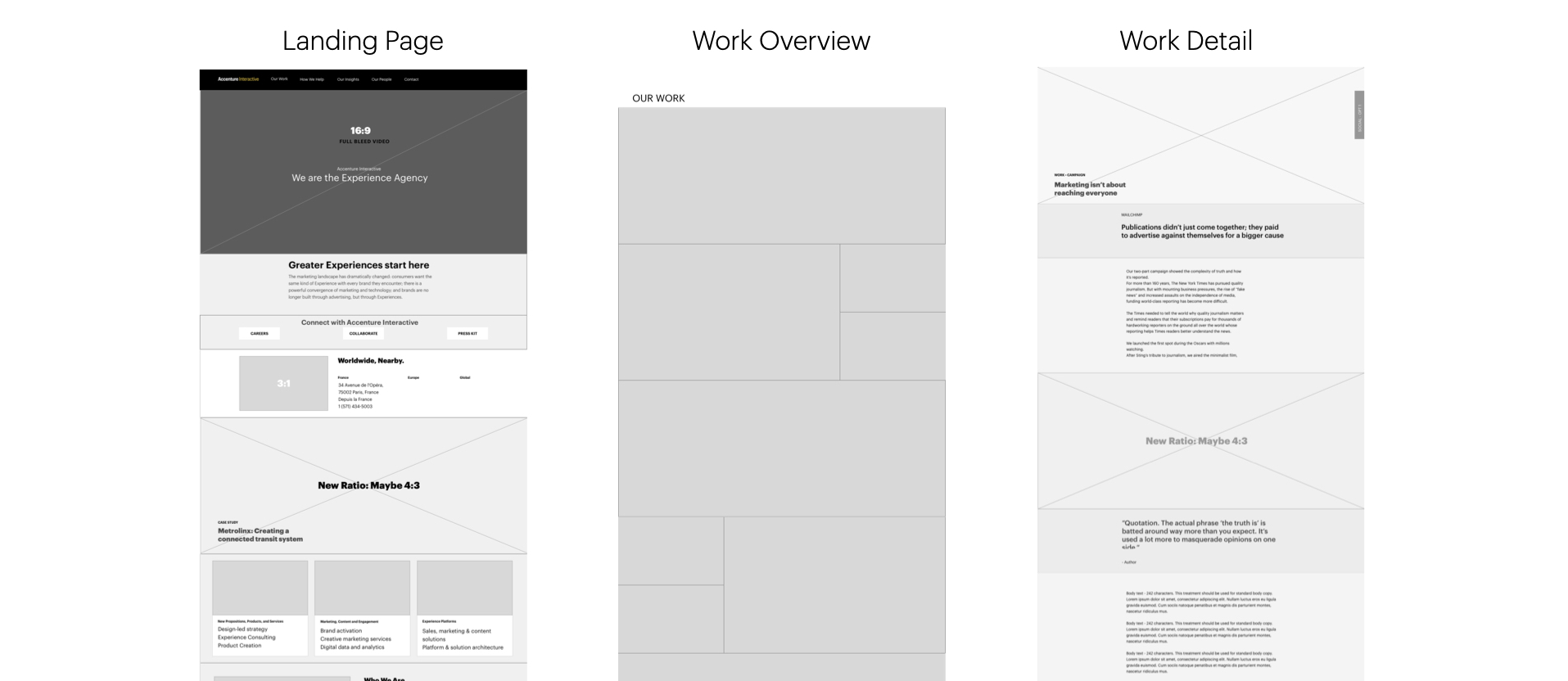
Based on the stakeholder interviews, we have came up with the page templates that are critical for us to design.
Final Deliverable
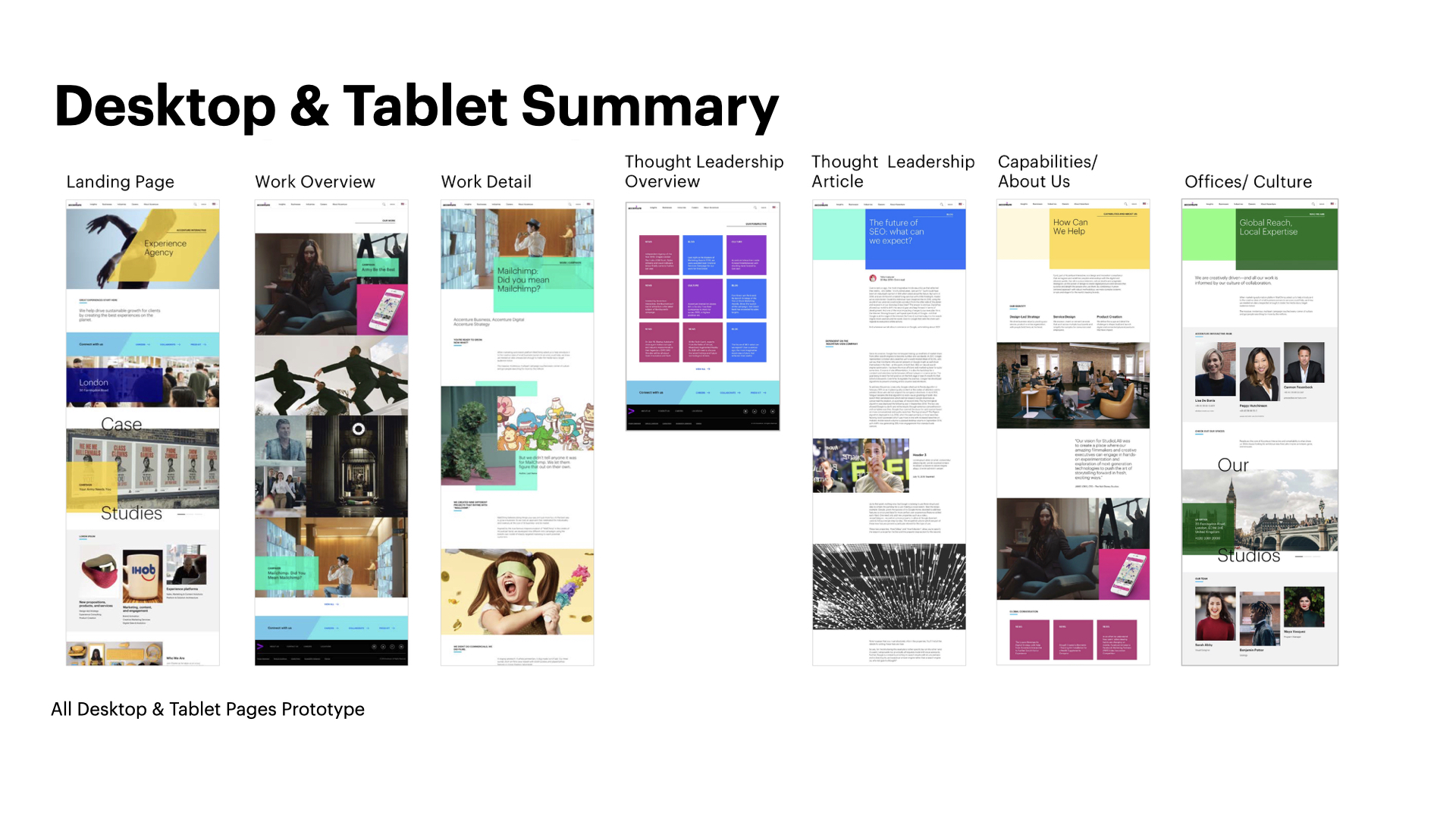
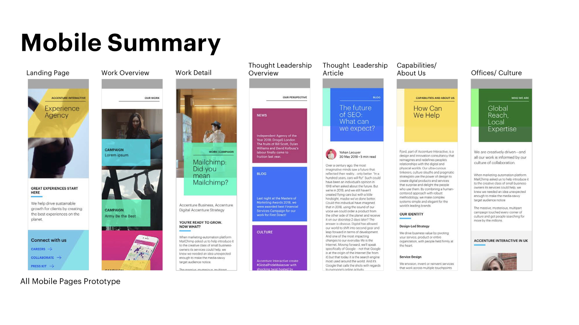
The deliverable was an updated PDK Documentation, including page templates, blocks, modules, components, visual definition, and prototypes of page layouts for mobile, tablet, and desktop.
Reflections
When we started to tackle the site navigation, we realized that it was a much larger task since it involves the larger organization's participation. I also wished we had time to validate the design with the broader team to understand if there were gaps that we needed to fill in with our design. It would also be a much collaborative experience to work together with the developers instead of a handoff with documentation.
Selected Works
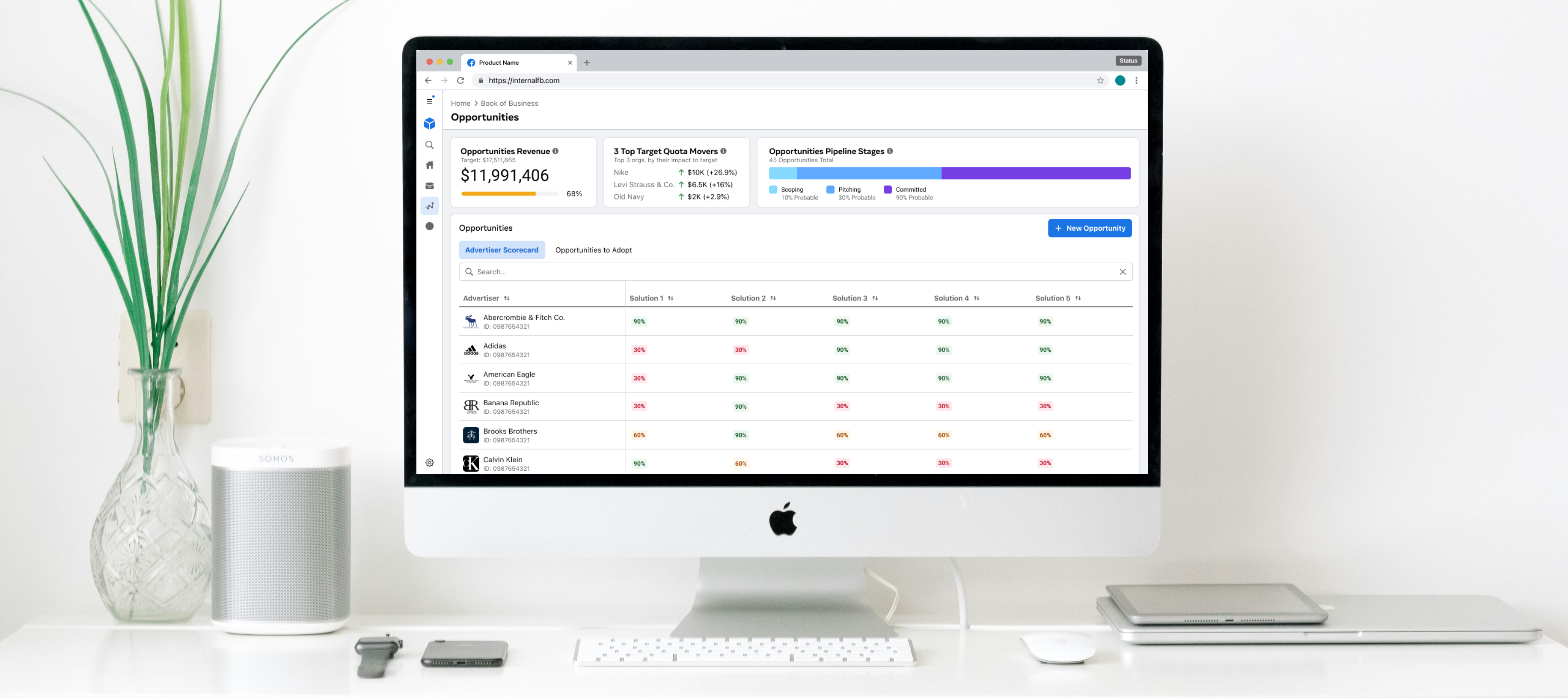
Meta CRMWeb Platform / UX • UI • Research
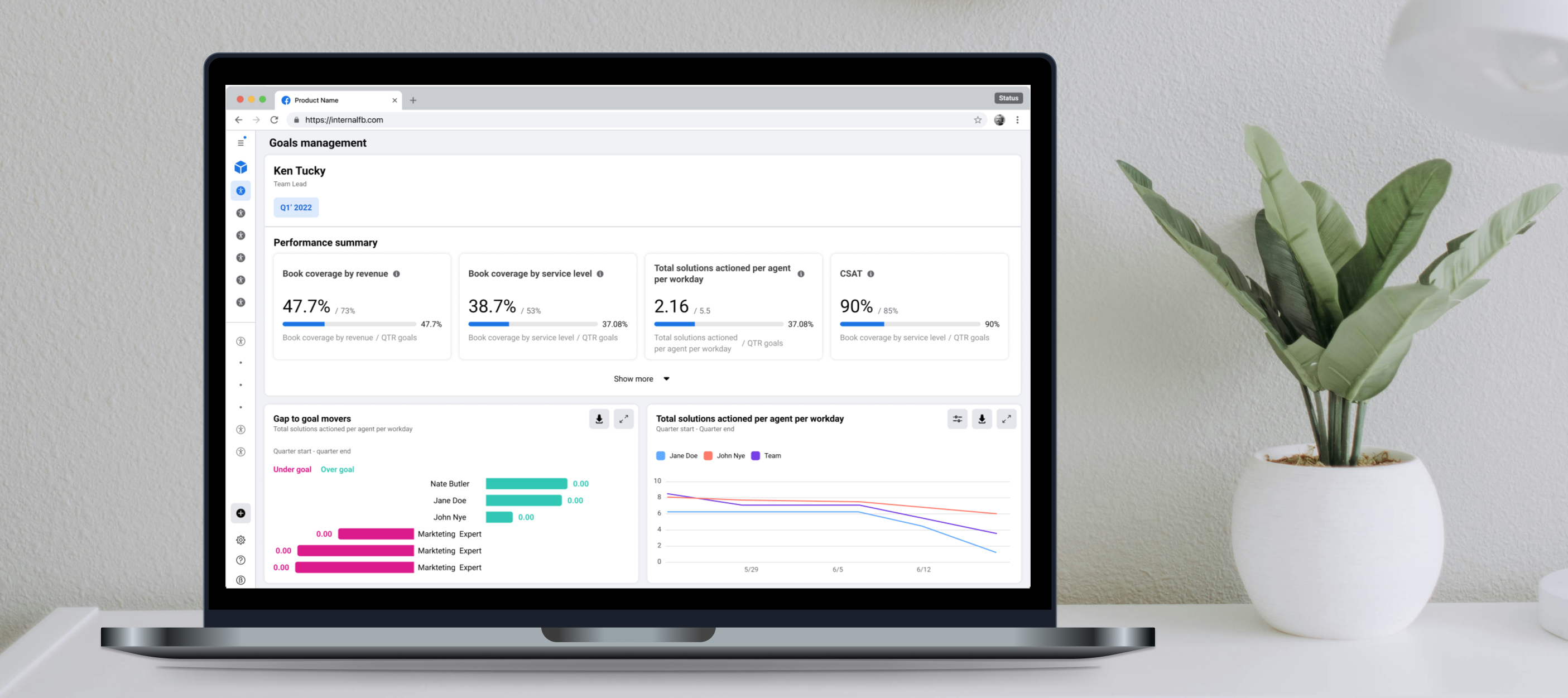
Goals ManagementWeb Platform / UX • UI • Research

Accenture Interactive WebsiteWeb and mobile Platform / UX • Research